
SHERO
End-to-end:
Brand Strategy
Brand Identity
Marketing Collateral
Web Design
Webflow Development
Illustrations
End-to-end:
Logo and Branding
Brand Style Guide
Website (coming soon)
Workbook
Flyer, Poster, Banner
Business Card
Illustrations
Figma, Webflow
Adobe Creative Cloud
(Photoshop, Illustrator, InDesign)

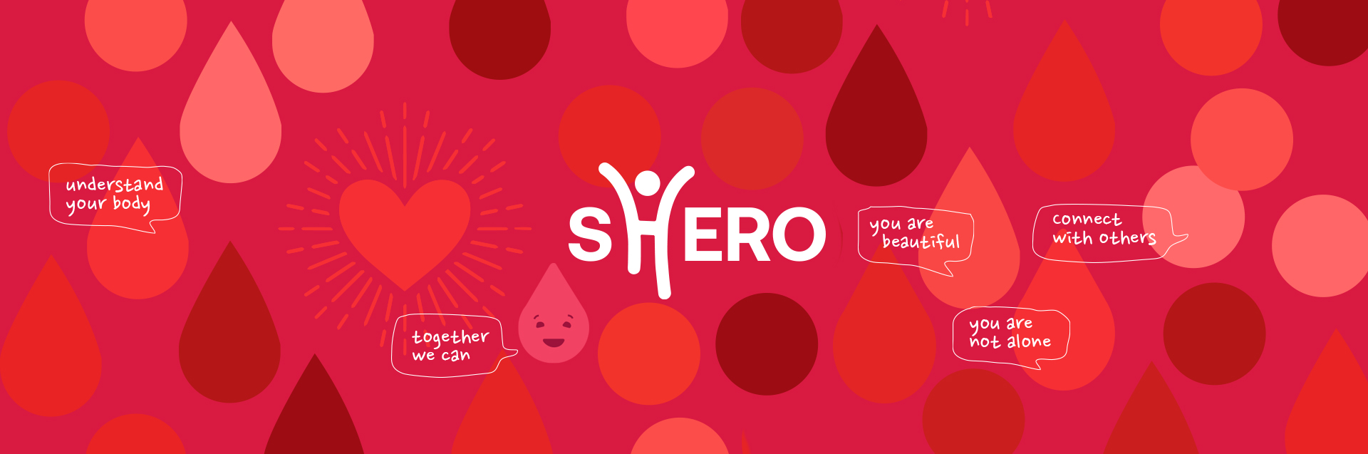
SHERO a grassroots initiative aims to end the silence and stigmatism around women's reproductive health, particularly women from multicultural and underprivileged backgrounds. Through a series of live and interactive workshops, women of all backgrounds can connect, openly discuss and learn about their reproductive health in a safe and supportive way.
Founder San Tran, inspired by her personal reproductive health experience and stories of her patients as Sonographer, want to empower women to gain the knowledge and confidence, to make informed decisions about their reproductive health. San came to me wanting a new brand and marketing collateral to promote the launch of the first series of educational workshops and resources; "SHERO Girls, Your Ultimate Period Guide", tailored to help young girls with their menstruation as they begin their reproductive health journey.

After some high level discussions with San about SHERO's mission, core values, target market, tone of voice, unique selling proposition, and conducting research on industry and competition, I presented three distinct logo concepts and brand directions. The challenge was to create a brand with five target market segments with its own distinct flavour, and still connected to a parent brand, with the flexibility to grow and adapt. Taking into consideration the results of A/B Testing and feedback from the target market and professionals from industry, the logo and brand direction was selected by San and her team.
VIEW STYLE GUIDE


The chosen logo concept and brand direction was then fleshed out further, and was rolled out to the workbook, flyer, poster, banner, business card, and website. Making tweaks along the the way, as we received further feedback from the target market and industry professionals, ensuring that the brand was relevant, engaging and aligned with SHERO's brand strategy.
VIEW WORKBOOK


Coming soon, currently in production.
A cohesive brand was created and rolled out across various channels, that allowed SHERO to grow and adapt into the future. SHERO Girls was engaging and all the designs proposed were adopted and San was very happy with the outcome. Some comments we had from the target market were; "I love the illustrations, colours and design - it makes the content so much more engaging", "I love the aesthetics", and "makes me want to engage with and read the content".
By empathising and connecting with San, listening to her journey and stories of her patients, really help guide and bring this project to life (through storytelling). Understanding the reproductive health challenges that these women face, helped me find solutions to real lived experiences.
The value of iterative design, A/B testing on different logo concepts and brand directions helped identify the most effective elements and refine the final design. Incorporating ongoing feedback from the target market and industry professionals ensured that the brand remained relevant, engaging, and aligned with SHERO's brand strategy.
The ongoing benefits of a well-structured and well-considered design system really helped speed up the process, from concept to delivery. It also help keep things consistent and allow for future scalability.